


Creating your own files
Guidelines for Bleeds, Cut Lines, and Safety Margins
We support all major layout and design applications. Click on the link below to explore how to set up your artwork for commercial printing. Click on the name of the application you’re using below for more details.


Preparing Artwork Files
The most popular file format for saving files for printing is Adobe Acrobat’s PDF (Portable Document Format). This is because PDF files can preserve the formatting, layout, and color accuracy of the original document, and are widely supported by printing companies and software applications. Additionally, PDF files can be compressed to reduce file size without losing quality, making them easy to transfer and store.
We also accept properly formatted native files generated from most Adobe and Microsoft products. If you can create a PDF from the application that you’re using, we can more than likely work with its output. Please contact us if you don’t see your preferred file format or need assistance with generating a PDF from your application.
While we always recommend using Adobe Acrobat Pro, not everyone has access to this tool. In this case, we have had good success using Bullzip PDF Printer. Bullzip works as a Microsoft Windows printer and allows you to write PDF documents from virtually any Microsoft Windows application. This means if you are using an obscure software program to generate your content, you can still create a file that is compatible with our systems.
This program is FREEWARE with limitations, which means that there is a FREE version for personal and commercial use up to 10 users. It does not contain any advertising or popups. For commercial applications with more than 10 users, there are commercial versions available with advanced features.
That depends on the type of document you’re sending. If you’re providing a print-ready PDF, the PDF is the only file you’ll need to send. However, if your document was created elsewhere (in a page layout program like InDesign, for example), you will need to include the page layout document, fonts, and any image files used in your design.
Here’s a quick and simple checklist for designers to confirm that their document is ready for printing.
- Your document is set up with bleeds (usually a minimum of 0.125″ on each side).
- Your design was created at the final print size of the project.
- The resolution of your artwork is at least 300 dpi.
- Your document is in the CMYK color profile and images in the document have been converted to CMYK.
- All essential content is within the safe zone or margins (usually a minimum of 0.25″ on each side).
- All images or graphics have been embedded into the document.
- All text/font items have been converted to outlines if using Illustrator.
- If you’ve confirmed that your document is ready to print, you will need to package your document.
- Save or export your document as a high resolution PDF file and include it with your packaged files.
Images / Links
Page-layout programs (such as InDesign or Illustrator) do not actually save the images you insert as part of the document. Instead, they point to the image files on your computer. If you send us only the document file you created in the page-layout software, we may be unable to print the images it references, or they’ll print in a very low quality. To get around that, make sure you save the entire package. Most page-layout programs offer a “packaging” option. If yours doesn’t, please remember to send us the actual art files that your project uses in addition to the document file.
Fonts
While it’s true that we have an extensive font collection in-house and probably have fonts of the same name as those in your project, fonts from different manufacturers may not have the same characteristics even if they share the same name. These inconsistencies can produce unexpected output. The only way to guarantee correct output is for us to use the same fonts as you did, so please include your fonts.
Windows
Compressing files is easy using Windows. Select (highlight) the files and/or folders you want to compress, right-click, scroll down to the “Send to” item, and select “Compressed (zipped) Folder” from the submenu that appears. Your computer will create a new file, with the file extension “.zip.” This is the compressed file you should send to us.
Mac
Compressing files on a Mac is a fairly straightforward process. After selecting (highlighting) the files and/or folders you wish to compress, use this method to create an archive of the compressed files:
- Control-click on the file(s)/folder(s) you wish to compress (right-click), and select “Compress.” You can also select the File menu and then choose “Compress.”
Your computer will create a new file, with the file extension “.zip.” This is the compressed file you should send to us.
Packaging an InDesign file is like physically sending something in the mail. For example, let’s say you have ten different bottles to send, all to the same place. You could place them into ten separate containers and send them individually. However, that would be cumbersome, inefficient and lead to clutter. Instead, placing them all in the same box and only having to send one box is a much better option. This is the idea behind the packaging utility in InDesign.
Before packaging your file, make sure you know what’s about to take place and how to prepare everything correctly. One of the best ways to accomplish this is by naming or renaming all the included files something uniform. This keeps everything neat and tidy. Next, check to make sure all fonts are active, licensed and can be shared. This is especially important if we need to edit your file. Finally, check your links to make sure they’re all valid.
Packaging the InDesign file creates a new folder, which you can name whatever best details the contents. When packaging occurs, all links and fonts are collected and placed in a folder.
How to package InDesign files:
1. Open Adobe InDesign and load the intended InDesign file you wish to package
2. Under the ‘File’ menu, select ‘Package’
3. Click the ‘Package’ button on the popup window
4. Click ‘Continue’
5. Select where you would prefer the file to be packaged to on your computer
6. Click ‘Package’
The contents of your package should now be in the newly created folder. From there, you’re able to compress and send the contents to us. We recommend compressing the files into a zip folder, then using the Send Files button on our website.
Please include a high resolution PDF file as well.
You can gather the files you’ve used, including fonts (except Chinese, Korean, and Japanese) and linked graphics, for easy handoff. When you package a file, you create a folder that contains the Illustrator document, any necessary fonts, linked graphics, and a package report. This report, which is saved as a text file, includes the information about the packaged files.
1. Choose File > Package.

2. Specify the folder and location settings:
Location
Specify the location to create the packaged folder
Folder Name
Specify a name for the package. By default, the name of the folder is derived from the name of the Illustrator document.
3. Specify the following options:
Copy Links
Copies linked graphics and files to the package folder location.
Collect Links in a Separate Folder
Creates a Links folder and places all linked assets in that folder. If not selected, assets are copied to the same folder level as the .ai file.
Relink Linked files to the Document
Changes links to the package folder location. If not selected, a packaged Illustrator document maintains links to assets in the original location, and assets are collected in the package anyway.
Copy Fonts used in the Documents (Except CJK)
Copies all necessary font files, not the entire font family.
Create Report
Creates a summary report to accompany the packaged files. It includes a summary of spot color objects, all used and missing fonts, missing links, and details of all linked and embedded images.
4. Click Package.
The following folder structure is created, with assets placed in their respective folders.

Please include a high resolution PDF file as well.
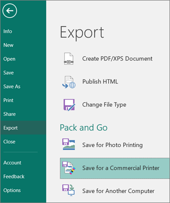
The Publisher Pack and Go Wizards pack a publication and its linked files into a single file that you can take to a commercial printer. Using the Pack and Go Wizard ensures that you’ll have the files necessary in the format required to hand off the completed publication to someone who can work with or view it.
Pack your publication for commercial printing
- Click File > Export > Save for a Commercial Printer.

- In the Save for a Commercial Printer task pane, select the file quality option you want:
- If you’ll be using an offset printing service, select Commercial Press.
- If you’ll be using a high-end copy shop, select High quality printing.
- Standard and Minimum size are additional options designed for online distribution or on-screen display only.
- Click the Pack and Go Wizard button.
- In the Pack and Go Wizard, choose the location where you want to export the file, and then click Next.If you pack multiple publications, save each packed publication to a separate folder. Otherwise, the Pack and Go Wizard will overwrite any pre-existing packed publications.You can save the file to removable media, a hard disk drive, an external drive, or a network drive.Save files to removable mediaIf you are taking your publication on disk to the printing service, click the appropriate drive (usually D or E for removable media such as a writable CD or USB Flash Drive).Save files to a hard disk drive, an external drive, or a networkIf you are putting your files on an external drive, a network, or your computer’s hard disk drive, click Browse, choose the drive and folder that you want, and then click OK.You can later upload the file to a Web site if your commercial printing service uses file submission on the Web.
- Click Next or Finish.
- Select or clear the Print a composite proof check box, and then click OK.
The Print a composite proof check box is always selected by default. Use the composite proof to review and catch any errors in a printed version of your publication before you send the file to the commercial printer.
Now that you have your files, you are ready to place your print order with us. Upload your files directly to your CSR HERE.
It’s becoming increasingly popular to design artwork online through the use of services like Canva. When doing so, it’s essential to make sure your files are set up correctly for the best print outcome.
Before you begin designing, we recommend that you turn on the print bleed setting. This function will allow you to view items going off of the page.
How to Set up Your Print Document
• Click on “File” in the top left corner of your screen.
• Then check “Show print bleed.” Bleed lines are essential for all photos and colors that extend to the edge of the page.
• Due to the risk of a shift when cutting, make sure you extend the images outside of the bleed line to guarantee your document does not have a white stripe along the side of your page.

When you are happy with your design, it’s time to download the print files.
How to Download Your Print Document
• Start by clicking the download button in the top right.
• Under “File Type,” make sure “PDF Print” is selected. (Not PDF Standard).
• Make sure “Crop marks and bleed” are checked. While we do not require crop marks on our files, it is important that your file contains bleed. This setting will give you more bleed than needed, but it’s better to have more than not enough.
• Download your files in a single-page PDF format.
• Click “Download” to receive your files.

Now that you have your files, you are ready to place your print order with us. Upload your files directly to your CSR HERE.
Helpful Resources
Color Modes
Pre-Press File Prep 101
Ever wonder why the image you pulled from your website doesn’t look good in print? It all comes down to correct image resolution.
To ensure your printed images look clear and crisp, your image resolution should be at least 300 dots per inch (DPI) at the final output size.
Take a look at these examples:

The image on the left is an example of a low-resolution photo or 72 DPI. This is how an image from your website would look printed. The image on the right is a high-solution photo or 300 DPI. This is the image resolution you want for printing.
Caution: You cannot simply convert a low-resolution photo to a higher resolution by increasing the DPI in your imaging program. The printed result will be a blurry image.
Resolution is also known as PPI or pixels per inch. It is a measurement of the number of squares (or pixels) of color information available in an inch of space. The more squares, the better the image quality. Below is an illustration of how the same image might appear at different pixel resolutions.
![]()
CMYK (or process color) is the color mode used in commercial printing to create full-color graphics and images.
The process involves combining varying amounts of cyan (C), magenta (M), yellow (Y), and black (K – for “key”) ink to produce the full spectrum of color.

The other color mode you’re probably familiar with is RGB color. RGB uses three colors: red (R), green (G), and blue (B) to create a full-color effect.
For best results, when designing your artwork for print, start with CMYK color mode. This will help ensure your images and background colors look great from the start. Of course, you can create your artwork in RGB, but then it will have to be converted to CMYK after the fact.
While most colors translate pretty well from one color mode to the other, subtle color shifting is common when converting from RBG to CMYK (and vice versa), requiring some manual adjustments to get things just right.
 | Printing, Labels, Signs, Banners, Copies, Promotional Products, Posters, Graphic Design in Midland and the Great Lakes Bay Region")
Take a look at the image above. Do you notice the slight variations from RGB to CMYK color modes?
Other examples of this include how many software programs will translate a 100% blue RGB value into a CMYK color that looks more purple than blue. Such changes will need to be accounted for if you start with an RGB color mode and then convert to CMYK later on.
If you send us files that use RGB color, we will convert your files to CMYK before printing them. In such cases, we recommend you view a printed proof before we complete your order, so you can see how the converted colors will appear in print.
For information on setting up your files to use CMYK color, visit our application-specific instruction pages.
Converting Images in Adobe Photoshop
If you’re using images from a digital camera or your phone, those photos are most likely using RGB color. Here are the steps to convert an RGB image to CMYK color using Adobe Photoshop.
Create a copy of your original image and open both in Photoshop. This will provide you with a point of reference to look back on once you’ve converted your image to CMYK.
Choose the copy you want to convert and select Image > Mode > CMYK Color from the main toolbar at the top of the screen. This will convert the image to CMYK.

Referring back to your original image (still in RGB mode), adjust the colors as needed. In most cases, Photoshop will do a good job converting the file, but subtle adjustments may be needed.
Good Files
 Quick Reliable Printing (QRP) | Printing, Labels, Signs, Banners, Copies, Promotional Products, Posters, Graphic Design in Midland and the Great Lakes Bay Region")
For best printing results, keep these in mind:
Bleed Line: Artwork is extended to the solid, green line.
Cut Line: The orange line indicates the edge of the finished, printed document.
Safety Margin: Remember to not place text into the beyond the blue line because it could get cut off in the trimming process.
Bad Files
 Quick Reliable Printing (QRP) | Printing, Labels, Signs, Banners, Copies, Promotional Products, Posters, Graphic Design in Midland and the Great Lakes Bay Region")
Watch out for these signs of bad files:
Bleed Line: The bleed does not extend to the green line.
Cut Line and Safety Margin: Watch for text that extends into the safety margin as it could be trimmed off during cutting.
The actual edge of a trimmed piece can vary by as much as 1/16″ from the planned edge of the page. A “bleed” area is used to compensate for this variation.
If your printed piece calls for a border along its edge, you will need to extend that border 1/8″ beyond the outside cut line, in order to ensure that it prints properly. Otherwise, you might run into issues when the piece is cut to its finished size.
Good File
 Quick Reliable Printing (QRP) | Printing, Labels, Signs, Banners, Copies, Promotional Products, Posters, Graphic Design in Midland and the Great Lakes Bay Region")
We recommend a minimum border width of ¼” inside the cut line, plus 1/8” of extra thickness beyond the cut line for a total width of 3/8”. A ¼” border with a 1/8” bleed will ensure that the print piece looks clean, sharp, and symmetrical when it is trimmed.
Bad File
 Quick Reliable Printing (QRP) | Printing, Labels, Signs, Banners, Copies, Promotional Products, Posters, Graphic Design in Midland and the Great Lakes Bay Region")
A thinner border (1/8”) inside the cut line may look good on your proof, but once it is printed and trimmed, variations in the trimming process may cause it to lose its symmetry and appear crooked. Increasing the thickness to ¼” (plus an 1/8” bleed) will help to compensate for these slight differences.
If your artwork contains vector-based graphics with transparency or other special effects, you’ll need to make sure to provide us with a copy of your files with flattened images and all fonts converted to outlines. Transparent, unflattened artwork and non-outlined fonts may not print properly, resulting in costly delays and reprints. Below are instructions for flattening your artwork and converting fonts to outlines in Adobe Illustrator and InDesign.
Adobe Illustrator
Create a copy of your file and save the original in a safe place (in case you need to make changes later). Once you’ve flattened your images and converted your text to outlines, you will not be able to edit those elements again.
1. Working from your copied file, select all the layers in your document (Ctrl-A or Cmd-A).
2. Choose Flatten Transparency from the Object menu.
 | Printing, Labels, Signs, Banners, Copies, Promotional Products, Posters, Graphic Design in Midland and the Great Lakes Bay Region")
3. Check “Convert All Text to Outlines” and “Convert All Strokes to Outlines” in the Flatten Transparency dialog box.
4. Uncheck “Preserve Alpha Transparency” and “Preserve Overprints and Spot Colors.”
5. Save Adobe PDF Preset as “Illustrator Default” and select Acrobat 6 (PDF 1.5) from the Compatibility drop-down menu.
 | Printing, Labels, Signs, Banners, Copies, Promotional Products, Posters, Graphic Design in Midland and the Great Lakes Bay Region")
Adobe InDesign
Create a copy of your file and save the original in a safe place (in case you need to make changes later). Once you’ve flattened your images and converted your text to outlines, you will not be able to edit those elements again.
1. Working from your copied file, select all the layers in your document (Ctrl-A or Cmd-A).
2. Choose Create Outlines from the Type menu to convert your text to outlines.
 | Printing, Labels, Signs, Banners, Copies, Promotional Products, Posters, Graphic Design in Midland and the Great Lakes Bay Region")
3. Select Export from the File menu to create a PDF.
4. Save Adobe PDF Preset as “Press Quality” and select Acrobat 5 (PDF 1.4) from the Compatibility drop-down menu.
 | Printing, Labels, Signs, Banners, Copies, Promotional Products, Posters, Graphic Design in Midland and the Great Lakes Bay Region")
Please make sure you are using a font size larger than 7 pt. Type that is smaller than 7 pt can be difficult to read.
Also, with type smaller than 22 pt, using 3 or fewer CMYK colors will help to avoid misregistration.
 | Printing, Labels, Signs, Banners, Copies, Promotional Products, Posters, Graphic Design in Midland and the Great Lakes Bay Region")
1. Additional Revisions
Did you complete all revisions and confirm design approval with all parties before sending?
One of the biggest time wasters is sending files before your content is ready and correct. This can halt the production process if there are any additional changes required.
2. Missing Bleeds
Did you include a bleed of .125” on every page?
If your design runs all the way to the edge of the page (i.e. no white border around it), be sure to include bleeds with your artwork. If using print-ready PDFs, remember to include the bleed on your PDF file as well.
3. Low-Resolution Photos
Did you make sure images have a resolution of at least 300 dpi (dots per inch)?
Use JPEG or TIFF files for printing and avoid random graphics you find on the web. If possible, use InDesign’s preflight tool to catch image resolution images before you send to production.
4. Poor Quality Logos
Did you include a high-resolution (or preferable vector) version of your logo?
When you send your files, be sure to include a vector version of your logo. Scanning your letterhead or dragging one off your website or email will not yield the quality you’re looking for.
5. Missing Fonts
Did you package all fonts used in the design?
Make sure to use fonts that you are licensed to use and include all of them when sending your files.
Tip: Google fonts are free and “Open Source.” That means you can use them in any way you want including commercially, online, or in print. Using a preflight tool should also catch this common, missing-font mistake.
6. Folding Errors
Did you make a folded sample from your file print out?
Be sure to check that your folding panels are the right size and the front of your piece lines up with the back. If you are unsure of how to determine panel sizes, please check with us first.
7. Unorganized or Messy Files
Did you ensure all necessary files are included and packaged correctly?
Whenever possible, package all files, fonts, and links together. Be sure to eliminate any unnecessary information like previous file versions, unused color swatches, and extra art.
Design Ideas
No matter what business you’re in, you will always need to have a way for professional communication, and it needs to be the right look and feel for your company.
Here are some tips for making your letterhead more beautiful and effective in your marketing efforts.

1. Guidelines and Specifications
Your letterhead should coordinate with your business cards and other marketing materials. To coordinate well, you should establish some basic guidelines when creating and ordering letterhead, such as:
- Position, size, and color of the logo.
- Margins and positioning for the letter content.
- Guidelines for the second sheet.
2. Paper and Printing Selection
When choosing paper, ask to see samples to see how your logo and colors will hold up on the paper. You’ll also need to consider surface quality and texture, content type (e.g., tree-free or recycled), stock availability, cost, and more.
There are several professional options for printing, too. For example, offset lithography, gravure, flexography, screen printing, nonimpact, letterpress, and specialty processes. You will want to check out your options to determine which method aligns with your brand’s look and feel.
3. Design Considerations
When it comes time to design your letterhead, remember to keep these seven tips in mind.
- Design enough space for letter content
- Provide vital contact information
- Utilize consistent elements within the entire brand identity
- Design for consistency across other brand applications
- Design a second sheet without the logo and some of the design elements
- The letterhead should enhance the bond between the reader and the brand
- Make the design relevant to your audience
4. Process of Designing and Producing Letterhead
Letterhead is part of a “larger visual identity stationary system,” including brand name, logo, color palette, brand, brand signature, and more. There’s a lot that goes into designing an effective letterhead. Here are some of the elements:
- Identifying the components of the stationery system
- Acquiring the necessary content information
- Designing all parts, both print and digital
- Choosing paper and ink
- Working with the printer to manage production, review proofs, and supervise the press run.
Practical Considerations for Your Letterhead
- Scans and faxes well
- Works well in print and on-screen
- Ensure paper quality and appropriateness
- Works well in a printer and with black printer ink for text type
- Enough room for content
- Easy to read
- Conforms to regulations sizes for international office use
- The second sheet coordinates well with the letterhead.
When creating expert letterhead that will make your brand look its best, look no further. You’ll find what you’re looking for right here. Reach out today!
Looking for a way to get your message out clearly and concisely? Many companies use concept catalogs to show the wide range of products and services they offer. By creating a magazine-like catalog, you will look professional and won’t have to cram a lot of information into a small space. You will have the space to display beautiful photos, graphics, illustrations, along with all the text you need.

A concept catalog will provide a great perspective of your business, even if your potential customers haven’t physically been in your building. This catalog spells out what you do, how you do it, and how it benefits your potential clients. It’s better than a brochure because it gives you endless space compared to just a few panels. So, how do you create a concept catalog? Here are a few tips.
Pick a Horizontal or Vertical Layout.
After you’ve chosen your layout, start conceptualizing the catalog, so it reads smoothly and in an organized way. Add a way to find objects quickly and effectively, such as a table of contents or an index.
Capture the Audience’s Attention with Beautiful Photos of Your Work or Products.
Since clients can’t touch the product, using the right images will accomplish this need.
They will see the details and the beauty of what you offer. Be careful to choose the right images that do just that. Be sure to show your product at different angles so clients can have a clear view.
Show Matching or Complementary Products in the Pictures.
This is a great way to upsell more products.
If a customer needs one of your products, show how the other items make their purchase that much better. When you are printing a catalog, you can get away with showing more items per page, but make sure there is some balance.
Use White Space.
White space can really be any color. It just means you need to have some blank space without text or photos. This will help emphasize the pictures and text that you do use.

Tell Your Story.
Let your words fill in the gaps that the images can’t emphasize. Let customers know what you are selling and how it will benefit them. Not only that, but try to include some personality by telling about the creator or designer of your product. This will help build a connection with the reader.
Include a Call to Action.
Make sure you add a call-to-action in your catalog to encourage customers to take the next logical step—to buy. Include your website, email, and other contact information to make it easy for prospective clients to get a hold of you and purchase or even ask questions.
Overall, a concept catalog will help further your reach. It works well for clients to preview what you offer. It creates desire and explains how your product can work for prospective clients.
Times change, people change, and brands change right along with them.
Change is reflected not only in the core values of your organization but also in your designs. And certain graphic elements age better than others. When shaping your visual identity, it’s essential to consider your logo’s life cycle because a logo is the front door of your brand image.
3 Question to Ask Before Your Rebrand
Does your logo need a refresh? Here are three areas to focus on as you process that question:
1. Graphics: Do the primary shapes and elements in your logo look dated? Can you make minor changes or simplify the artwork to modernize your logo?
2. Color: Is your logo’s color scheme old-fashioned or inconsistent with your branding? Can you refresh it by using different shades of the same color?
3. Typography: Do the logo fonts match your brand personality? Can you fix the design by choosing a more streamlined, timeless font?
If you are planning an update, a partial edit may be less risky than a full rebrand.
But if you do go all in, make sure you carefully consider the life cycle of your new logo. Trends come and go. While it’s fun to be edgy, timeless designs are more likely to connect with your target customers for years to come.
How to Create an Image that Lasts a Lifetime
- Go for colors and graphics that are simple, bold, and easily identifiable (think of the VW Volkswagon emblem, for example)
- Stick to a classic font and make it the focal point of your image
- Try monochrome formats if you’re using more intricate design details (like a tree with many branches)
- Choose elements and fonts that work well across a variety of print and digital media
- Use grainy textures or vintage styles to give your logo a sense of maturity or a look that purposefully leans into the past

Establishing a strong logo may take some time, thought, and market research, but it is certainly worth it! Brand builders must look ahead to stay ahead because the most cohesive brands will last.
Have you ever been sucked into the vortex of Twitter?
Individual tweets are forceful because Twitter forces people to say things succinctly: anyone who writes a tweet has to do it in 140 characters. That’s not a lot of space! And, as any practiced writer knows, it’s not easy to distill a message to its essential core.
Just like writing, concise designs create a profound impact. And while everyone loves some bells and whistles, there is such a thing as over-designing. This usually occurs when you set out without a distinct direction or a focused design solution. While it is easy (and even fun) to overdo things, ultimately this confuses the viewer and produces a muddled result.
Want to keep your concepts as sharp as possible? These tips will help.

4 Tips for Creating More with Less
1. Know What Your Design is Trying to Achieve
Over-designing is often a way to compensate for a lack of concept.
If you feel like you have to keep adding more to a design, you should stop and ask why. No amount of randomly applied bevels, embosses, patterns, or lens flares will get you closer to solving the problem.
2. Design with Constraint
Just because a design seems simple doesn’t mean it was easy to achieve.
Efficient designs use fewer visuals and create room for viewers to bring their own understanding or interpretations to the work. By limiting the number of components in your design, you leave space for active viewers to engage deeply and experience authentic emotions.
3. Simplify Complexities
What do you picture when you think of a bird?
Maybe flying, nests, or freedom? If you are trying to simplify your designs, brainstorm symbols that best convey your idea’s meaning. Instead of showing a bird in its entirety, you could sketch a feather, nest, or wingspan. Each viewpoint communicates a different sentiment, so choose symbols carefully and layer the background or colors to add emotional depth. Try footprints instead of a sneaker, smoke instead of a fire, or a steaming teacup instead of a cafe.
4. Don’t Be Afraid to Start Over
One of the hardest things to do with your design is to admit it’s not working.
It takes bravery to disconnect from your work and be honest about its effectiveness. Though it’s hard to give up on a concept, remember that by starting over, you’re not returning to square one. By scrapping a prototype, you’re just looking at your work from a different perspective. The work you’ve already done is still part of your journey to the final solution. Your time was not wasted – it was just part of the process!
“Good design is as little design as possible. Less, but better.”
–Dieter Rams, 10 Principles of Good Design
Have you ever heard the expression, “a picture paints a thousand words?” It’s true. While words can limit our ability to communicate ideas effectively, even a split-second glance at an image can convey volumes of information. Whether you’re a marketer or a design specialist, it is essential to employ tactics that add power and clarity to your communication.
Here are three techniques you can experiment with in print marketing to amplify your visual messages:
Signs
On a basic level, signs are the combination of a word and a picture to create meaning.

What comes to your mind when you see a red plus sign, an image of a dog with a slash through it, or a photo of a distressed person clutching their neck with two hands? Signs convey simple, universal ideas that viewers can understand immediately. Even colors themselves can have inherent meaning! Signs are especially helpful when communicating with mass audiences at a glance.
Typograms
A typogram refers to the deliberate use of typography to express an idea visually.
For example, the word “half” displayed with only the top half of each letter showing might imply an eraser effect. The word “volleyball” with the “o” popping out above the text brings a playful, spirited message. Typograms use basic visual enforcement to add subtext to the words you display. Logos, taglines, or custom envelopes are a great place to put typograms to work.
Symbolic Imagery
While signs communicate a very straightforward message, many images have connotative meanings with far more complexity.

While a house denotes a place where you live, a home has far greater connotations (like family, security, and love). A subject, the objects surrounding it, and the editing techniques you use can all play a role in the cognitive messages you bring. Consider these examples:
- Cropping a woman’s face to only the eye can make viewers wonder what she is thinking
- Cropping a man’s body to only his head and shoulders may suggest he’s leaning in to hear more
- Inverting colors may insinuate a flashback scene or a memory
- Increasing contrast between the back and foregrounds might indicate the object behind a person is about to surprise them
- Larger contrasts or color saturation can elicit feelings or arousal or cheerfulness
- Increased sepia tones can give an aged or vintage look (like a photo carried in a wallet)
While language can limit our ideas, an image communicates on many different levels. Proficient designers know the more clarity or complexity you bring to your print pieces, the greater impact you will have on your target audience. Use signs, typograms, and symbolic imagery to add emotional weight, to increase the efficiency of your communication, and to achieve a greater return from your marketing dollars.
Some rules are made to be broken.

But graphic design is an art that is anchored in the appropriate use of typography, composition, color, and images. Only after you have mastered some basics can you tease out variants or challenge the status quo.
Want some quick tips to add beauty to your page? Here are some design “dos” and “don’ts” from four world-renowned graphic artists.
DON’T limit yourself to just a handful of fonts
Many designers champion the theory that you need only 12 strong typefaces.
In the past, commercial options were limited, but now gorgeous alternatives hit the market daily! Build a catalog you favor, but keep adding to it, and never stop searching for perfection.
DO reward strong body typefaces with a long-term commitment
When you find a classy, confident body text, stick with it. These fonts create stability and design anchor points to build from. Commit to the best, and don’t waste time flirting with others.

DO choose colors for a reason
Everyone has favorite colors, but your design elements should reflect the brand and its personality – not your own. Pick colors with purpose, not just because you like them.
DON’T be afraid to be bold with your color choices
Bold color choices communicate power and confidence. Bold colors aren’t just neon but include anything unexpected (like combinations of avocado green with bright orange or deep brown with magenta).
DO check that all images have an effective 300ppi resolution
This creates sharp designs that won’t get distorted when resized. And never enlarge a 300ppi image beyond 100 percent within your layout.
DON’T import images with too high a resolution
If 300ppi is the industry standard, won’t 600ppi look twice as nice? Nope. A larger resolution will enlarge your file size and slow down prepress processing. Larger resolutions can also cause an uneven gradation of tone.
DO always apply some sharpening to digital images
Many photos shot with a digital camera will appear slightly blurred. Use Unsharp Mask or Smart Sharpen tools to bring a crisp finish to your image.
DON’T get sharp-happy
Oversharpened images look worse than “straight from the camera” shots, so take it easy. And remember to complete all other image adjustments before you apply sharpening. Sharpening should be your last imaging step before importing a photo into your layout.
These rules serve as a guide, but creative concepts are all yours. Keep things simple, clean, and uncluttered, and let the design speak for itself.
Other
Technical Tips
When communicating your message through design, your readers need your help to determine the importance of design elements on the page.
For example, you might make your call-to-action section larger or more visually striking while putting the minute details in a smaller font that doesn’t draw much attention.
Solving problems of emphasis using type and hierarchy is a critical skill and not as complicated as some might have you believe. Hierarchies will not only make your overall design more appealing, but they will help you communicate the primary and secondary information easily.
Here are some tips for doing typographic hierarchy well.
When You Want to Create Emphasis

The following tips will help you add emphasis to the essential pieces of your design.
Place with cases.
Changing some lowercase text to capitals can give your design a more formal look. With this technique, you’ll want to keep an eye on your spacing as ascending letters (b, d, f, h, l, k, t) can sometimes collide with descending letters (g, j, p, q, y).
Make important text stand out.
Using pull-out quotes is always popular, and if they are used correctly, they can help add emphasis to your piece. Set your pull quotes apart from regular copy text and let them form a bridge between columns.
When You Want to Create Contrast
Using contrast is another way to add emphasis to elements in your design. Experiment with these contrast tips below.
Experiment with contrasting condensed and extended type.
Condensed type can add a lot of interest to design with short, concise headlines, while extended type options will push out the length of your copy. Remember, while contrast is good, complexity is bad. Keep your paragraph styling simple and effective.
Use color.
Using color is another way to add interest. If printing your design, be sure to test the ink color on the paper stock you will be using. Transparent inks can make your message hard to read, and using colors that are too close together in value or hue won’t limit your impact. If using a soft color, try using a typeface with more weight and use it in a larger area. Sometimes, reversing the type works to get the attention you want.
Communicating Hierarchy with Numbers
Headings play an important role in your document. To ensure you’re hitting the right visual mark with your headings, try doing a little math.

The Fibonacci number series.
An easy trick to determine a hierarchy of font size is to use what’s called the Fibonacci series, “in which each number is the sum of the preceding two.” For example, if your caption text size is 8 pt. and your text is 10 pt., your subhead should be the size of those two sizes added together, 8 pt. + 10 pt. = 18 pt. Your title would then be 46 pt., as the subtitle size (28 pt.) and the subhead size (18 pt.) added together is 46 pt. While using math is good, trust your eye and be true to the content.
Less is More
Lastly, remember that less is more in visual hierarchies. Too many techniques make for a confusing layout, so use them sparingly. Too many elements will confuse the eye and make it tired. There is no need to overstate your points by using italics, bold, underline, and then making it an angle. This is overkill. Keep it simple.
Wondering the best way to communicate the importance in your message? We can help. Reach out today!
Is your business image stuck in a rut?
If you have the same branding that you’ve always had, and now you’re wondering why it’s not as effective as it was previously, it might be time to rebrand your business.

Customers gravitate to what’s new, innovative, and exciting, and the same old things don’t work indefinitely. It might be time to reposition yourself in the minds of your customers with a new name.
Here are a few steps to help you prepare.
- Do research in your archives first. Make a timeline of what logos and slogans your company has used in the past.
- Determine who the customer used to be. Make a list, starting with the very beginning of your business until now.
- Have a market analysis done to find out how people see you right now. You’ll get honest answers that you normally can’t get by asking them.
- Analyze what you are currently using: color, font, graphics, and more. This will help you determine how to change your current marketing plan.
Once you’ve done your research, you can change your image by coming up with a new name… the perfect way to rebrand. It will stir up excitement for your company in the minds of current customers and will cause prospective customers to take notice.
7 Steps to Business Rebranding
Here are seven steps to help you get started with your rebranding.
1. Pick a name that describes your business.
Try using something that represents what you offer and include part of that word with the new name. Think American Airlines or Burger King.

2. Use an acronym.
Use the first letters in several words to represent your business but keep it easy to remember. Think KFC for Kentucky Fried Chicken.
If this doesn’t appeal to you, try putting two parts of words together, such as FedEx. Instead of saying Federal Express, they shortened it but used enough of the words that it resonated with people.
3. Be creative by using something that doesn’t even relate.
Pick a color or a name that you like that evokes the feeling you’re trying to convey.
Think Orange Theory Fitness or Brown for UPS.
4. Use a neologism.
Make up a word if you can’t find one that represents your company. Or maybe find a word that you want to spell phonetically or try a silly word. If it feels right, use it.
5. Try onomatopoeia.
Use a word that sounds like something your company offers. For example, the Schweppes name makes the sound that its carbonized beverage makes when opening it.
6. Use another language.
Hunt for a word in another language that sounds good and has a positive image. (Make sure you research its true meaning, so you don’t evoke a negative image.)
7. Try incorporating your own name.
It sounds simple, but sometimes it’s the best idea.
Think Disney or Cadbury.
All About You!
Once you have created your new name, your marketing materials will need to be updated. Make sure your logo is up to date, as are the colors you use, and your tagline. For more information on rebranding, check out the book below or give us call!
There are some powerful software suites available today that will help you bring your idea to life, but few are as well-designed for print as Adobe InDesign.
At first glance, you might be a bit intimidated by the large number of buttons and gadgets you’ll see within the software. These InDesign best-practice tips will help you be successful when you’re ready to send your creation for printing. From starting with the end in mind to ensuring that all of your styles are correctly formatted for printing, you can leverage the power of InDesign to create print-ready pieces that you will be proud to share with your customers.
Begin at the End
InDesign has a fantastic feature called “Live Preflight.” This tool allows you to see any problems that your printer will find with the file before you send it. While designers traditionally would have to manually check their files for errors, or discover issues only after the output has been delivered for printing, Live Preflight helps catch things like missing fonts and images that are improperly linked upfront.

Thread That Text!
“Threading” your text allows you to flow content from frame to frame, making it much simpler to make changes to the size of text boxes and other page elements. Instead of being a bunch of disconnected paragraphs, this creates a more cohesive story that can evenly break across pages. Magazine designers use this cool functionality a great deal as they’re writing longer-form content, but it’s helpful even for smaller projects such as postcards or flyers, too.

Keep Your Formatting Consistent
If you’re not careful, you may find that your fonts, sizing, and colors are losing consistency throughout your printed piece. It can be pretty tough to see this before sending it for printing. The best way to maintain that consistency is through creating styles for all your formatting. If you’re used to highlighting a block of text and applying a different font or color – break that habit! Creating styles that represent the look that you’re trying to accomplish and then applying those styles to similar text blocks makes it easy to make global changes to text in the future.

One-Level High, Please
Stacking objects on top of one another may seem like an easy way to create advanced looks within your file, but this can cause some problems down the road. InDesign pros know that stacking objects is sometimes required, but should be avoided whenever possible to make it easier to shift items around on the page.
Here are two final (BONUS) tips:
- Keep your design simple.
- Keep your fonts embedded.
Eager for more InDesign tips and tricks? Contact us today!
When you are building an intricate design, you may notice some typographic font features (from bullets and em dashes to tildes and copyright symbols) can’t be found on your keyboard.
Have no fear! Your design software makes these irregular characters (called glyphs) simple to add or retrieve. For example, Adobe InDesign has collected many of these characters and displayed them in an easily-accessible flyout panel. Quark offers several keyboard shortcuts as well.
Here are some shortcuts to save you time.
Adobe Shortcuts
When using Adobe, grab the Type menu and pull up the “Insert Special Character” submenu. Here you can choose from five more submenus: symbols, markers, hyphens and dashes, quotation marks, and “other.” From these categories, you can insert items like bullet characters, trademark symbols, smart (or curly) quotes, and more. To see all the characters in a font, use the Glyphs panel, and if you frequently access the same glyphs, you can save them as glyph sets.
Quark Shortcuts
In Quark, you can insert a special character from the menu bar following these steps:
- Choose Utilities > Insert Character >Special or Utilities > Insert Character > Nonbreaking Special.
- Choose the special character you want to insert on your page, or to view the symbols for invisible characters, choose View > Invisibles.
- To insert a special character using the Glyphs palette, choose Window > Glyphs. Double-click on the glyph to insert it into your text.
There are also handy keyboard shortcuts for inserting glyphs and special characters directly into your design. Here are just a few:

Want to reduce stress and pick up the pace? While these shortcuts take a bit of practice to master, they’ll increase both the efficiency and excellence of your next masterpiece!

Creating a print project that pops takes more than having the best printer on the block. It also requires stellar design and text that is well thought-out and easy to read.
Have you ever wondered how those professionally designed print pieces look so incredibly clean-cut and crisp? To get that clean, easy-to-read look, professional designers make use of the big three in typography: leading, kerning, and tracking. Although all of them are important, leading can make or break a design.

What is Leading?
Simply put, the term ‘leading’ (pronounced LED-ing) refers to the amount of spacing between lines of text. (Fun fact: The term originated from hand-typesetting where thin strips of lead were placed into the forms to increase the distance between lines of text.) When you want to save space on a page or use up more space on a page, adjusting the leading is the way to go. Leading can also be used to change the aesthetics of your design, whether your text is the hero of your design or informational only. Mastering this design element will allow you to create balanced, well-formatted text that helps sell your product or service.
First Things First
When you type text into a word processing or graphic design program, you will generally get a pleasing result. Sometimes, though, the spacing may feel a bit “off.” This can be especially true if you’re using a variety of sizes, fonts, or other character adjustments. When you type the same word in a few different fonts, you will quickly see the difference between how the spacing works for individual words, both horizontally and vertically. No fonts are exactly the same, which can cause awkwardness in your design. The cure for that awkwardness is formatting.

General Formatting
Formatting can be applied at either the character level or the paragraph level. Paragraph-level formatting includes text alignment (left, right, center or justified) as well as spacing before or after paragraphs. Examples of character-level formatting include the style and choice of font, size of the characters, and the leading.

Application of Leading
While leading is considered a character-level attribute, it should generally be applied at the paragraph level to your text. This is because applying it only to a few lines of the text within a paragraph will only change the lines highlighted — which leaves you with an uneven final product.
Changing the fixed leading in InDesign can be accomplished in a few simple steps:
- Go to ‘Edit,’ then ‘Preferences’ in previous versions of InDesign, or ‘Preferences’ in InDesign CC
- Choose ‘Type’ from the left-side of the list
- Under ‘Type Options,’ choose ‘Apply Leading to Entire Paragraphs’
- Select ‘OK’
All finished! Now, every paragraph that you begin will inherit these same options, giving you very consistent and clear paragraphs that are easily read by your audience. InDesign is a very smart program, so even if you don’t set a leading value, you’ll find that it defaults to auto leading — which is 120 percent of the current font size. Realistically, that translates into a space between lines of 12 pts if you’re using a 10 pt font.
Want to learn more about how leading and character formatting can make the text in your next printing project really pop? Give us a call to get started!


 | Printing, Labels, Signs, Banners, Copies, Promotional Products, Posters, Graphic Design in Midland and the Great Lakes Bay Region")


 | Printing, Labels, Signs, Banners, Copies, Promotional Products, Posters, Graphic Design in Midland and the Great Lakes Bay Region")
 | Printing, Labels, Signs, Banners, Copies, Promotional Products, Posters, Graphic Design in Midland and the Great Lakes Bay Region")
 | Printing, Labels, Signs, Banners, Copies, Promotional Products, Posters, Graphic Design in Midland and the Great Lakes Bay Region")
 | Printing, Labels, Signs, Banners, Copies, Promotional Products, Posters, Graphic Design in Midland and the Great Lakes Bay Region")


 | Printing, Labels, Signs, Banners, Copies, Promotional Products, Posters, Graphic Design in Midland and the Great Lakes Bay Region")


 | Printing, Labels, Signs, Banners, Copies, Promotional Products, Posters, Graphic Design in Midland and the Great Lakes Bay Region")


